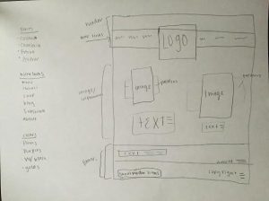
11A Web Page Layout

Sketch

Sketch

Shape Map

Shape Map

WebPage

Web Page Layout

Process:

I of course started with a sketch of what I thought I wanted where and in which order. I also thought of a few different color schemes and ideas but didn’t know which one I would end up doing. I knew I wanted to represent this made up company I started for a different class just because its been fun. I found the images I wanted to use and went from there. I had some idea of the elements I wanted to include but I looked on lots of other websites for some ideas. I wanted to direct the customer’s attention to the new summer collection and the new wrap headbands so that was my main point. I had some issues with alignment but I think after I added the borders in on Photoshop it helped me a lot. I forgot about the copyright part and the white space concepts until the critique so I am glad I was able to get a good rough draft in time for the teacher critiques. Overall, I do really like my product.

 Critique:

Teacher critique:

Fix transparency of the image or have both with the same texture don’t have it half and half. Make the logo wording more evenly centered. Make all the menu items stay together don’t split them up.

She liked the overlay with the pictures and patterned part as well as the diagonal lines. Add copyright information and make sure there is no white space.

Likes the white space on the top of picture.

Peer Critiques:

Beth Kirby: I love the monochromatic pink. My only suggestion is to capitalize the first words, or use title case where appropriate. Something about all lowercase letters seems to distract from the rest of the page. I love your concept and that you used background colors drop the pictures.

Lauren Forson: Cute idea, Suzie!! I like the color scheme you chose and the cute pattern you’re using. I would just double-check your alignment on a few things. Make sure everything is lined up and spaced proportionally. I also noticed that one of your photos is more transparent than the other, so I would suggest making them the same. Good job!

Critiques I made:

Jacob Hayes: This looks so professional! Really nice job of keeping it super simple but also kept all the important requirements. Make sure to either delete the guidelines or hide them for your finished product.

Israel Marquez: Nice work. I am very impressed with your creativity in your layout. I also really like the main image and how you made the shape really unique. Makes it more interesting. 

Color Scheme:

Pinks with Gold and Grey accents

Fonts:

Calibri (sans-serif) both bold and regular

Link to Images:

https://www.instagram.com/explore/tags/freebabes/

Do what you do best

The biggest thing that I learned from this week is probably the most simple concept ever but I was able to realize it that i am just not good at somethings and sometimes thats ok. The lesson learned was that you don’t have to reinvent the wheel; there are plenty of good wheels out there that you can copy. I mean in the fact that you don’t have to create a new website or new ideas from nothing use other things out there to inspire and help you expand your knowledge.

The interview

For this weeks Journal entry I am going to share what I learned form my Entrepreneur interview. These are both lesson that he learned and also words of advice for my future. My personal take away or the advice that he gave that really stood out to me was to hire the right people, create expectations and define roles, hold them accountable and give them the freedom to develop their skills. Always work to develop relationships whether they are directly associated with your business or not. Watch other successful people and business and does what they do but make it fit your model. You don’t have to reinvent the wheel; there are plenty of good wheels out there that you can copy. People are the key, inside and outside your organization, find the good ones and keep them focused. Overall I learned a lot and am very grateful for this experience and to have him as mentor in my life. This was the best assignment we have had in my pinion. I learned a lot and feel even more excited and prepared for my future as an entrepreneur. I think that a lot of it had to do with the person I interviewed but I still hope that everyone else had the same experience.

10A Movie Poster

LAST (1)


(please excuse my look in this video I have been really sick so I am not feeling supper great)

Typography:

Title: Impact- Sans Serif

Body Copy: SF Movie Poster Condensed Oblique

Characters/Date: SF Movie Poster Condensed

Critique:

Teacher: Add Body copy and then also make sure to use the movie poster Font either the one they have or another one.

Classmates: I only had one classmate respond and it was Kristen Dunnells and she said that I could use some Photoshop tools to add make up to match the original movie poster.

My Critiques: I Commented on Cody Carters and said this “Other than blending your self a little you did a great job! Make sure you have some sort of body copy as well. Nice work.” The second person was Brent Fisher and said this “I am very impressed. This looks so professional. I am pretty sure we have to do some sort of a body copy on our poster but I might be wrong. Just check on the requirements. “

Image:

One self-portrait I took selfie style:

One outside source picture: https://en.wikipedia.org/wiki/Silver_Linings_Playbook

Written Process:

Audience: This poster is for my class and also for anyone that would be interested in movies or movie posters.

Message: Just to inform people about the movie and bring awareness to the movie.

Process: This project took me forever. I seriously restarted this project about 20 times but I finally found something I didn’t hate and was able to fix it in Photoshop with lots of how to videos and now I have finished it. I matched our coloring together and I also matched our eye colors. One thing that I didn’t like about the printed version was the fuzziness on the words. I didn’t notice that in the Photoshop but maybe the printing makes them less crisp. I don’t know but it was definitely a good learning experience.

ads

This week in our discussion boards and assignment we started learning and working with Google analytics. I really have enjoyed starting this program and its integration with my website. I find that it is a really easy way to help you learn more about what ads are grabbing people’s attention and where I can better put my energy to make my site better. I have learned this week that idea you think will be great and appealing to others may not actually work at all. sounds silly but It has taught me that I don’t know much about ads and need to learn more about how people respond to them.

trustworthiness

We learned a lot about leadership and trust his week from the readings and videos. There was one video in particular that stood out to me. It was the video given by Guy Kawasaki, Garage Technology Ventures and the video was entitled “Aspects of building trust”. Having trust in other people is a great virtue to have. The main concept that I learned from the video was if you trust people they would trust you.

In the video he talked about how there are two different types of people in the world. There are bakers and eaters. The Bakers are the people who see a world that can make more pies and bigger pies when an eater sees the pie they need to get as much as pie as possible. Bakers are the truth worth type of people. We need to always be the person that can always help the other person. If we reach out to others and trust them then usually they will do the same. He also mentioned that if there is those people that try and take advantage of this they aren’t usually people your want to work with anyway. It thought this concept was so smart. Lots of times as a business owner you want to have this trust and loyalty with a customer well that loyalty starts with you.

Photographic Study Project


Photographic

Process:

For this Photographic Assignment we were asked to take unique pictures of one subject from different perspective and with different lighting. I desired to do my dog, Sadie. I really enjoyed trying to take different pictures of her from the different angles of my adorable pup. I tried to get down on her level and see the world more from her perspective with the camera.

The audience for this project was my classmate and probably anyone that has a dog or likes cute dogs. I might be biased but I think she is pretty adorable. My message was just to share the different part and perspective of a doggy’s life and the importance of it. We didn’t do a normal critique for this week so I don’t have classmates comments or the teacher comments. The photos were my own from this weekend. The fonts I used were Futura, which is from the Serif-sans Typography group.

the power of ads

This week we have been working on creating ads and what makes a great ad and whats make a bad ad. The point of creating an ad is to bring people to your website but also more importantly to get them to buy the products that you have becuase they were correctly directed to the product they were looking for. That being said I have learned the importance of using details and using product details that will make a better representative about the products you have.

LFC Photography Activity

FIND THE LIGHT:

Outside light

FullSizeRender

Inside Light

IMG_2560

CONTROL THE FOCUS

Background

IMG_2563

Foreground

IMG_2577

PLAN THE COMPOSITION:

Lead Room

IMG_2557

Rule of Thirds

IMG_3466

I enjoyed taking photos for this activity. I stayed very simple in my images so that I could really focus on the new technics we learned in the vital information video. With the light i let the natural light shine on the dogs face then i let the light in the outside light hang around the image  and not cause shadows on the object. For the focusing images I wanted something with little detail so that you can clearly see the difference between the foreground and background.  The last was just me trying to work on developing the rule of thirds and working on lead room concept. My edits were simple as well. I mainly focused on trying new style editing ways like colors, brightness and focus. Really just getting to know more about light room.

Social Media Strategy

Company: DOVE

Objective: Expand the knowledge of the new products

Strategy: Use the Instagram to promote the different products on the line and show how it works on customer’s hair. 

Critiqued:

I made Critiques on these two facebook posts BreAnna Fryer, Kristen Dunnells

Teacher: She gave me the critique to use the same font in all the posts and also to make sure there weren’t any one-word lines. Action: I did both of these changes; I agreed they would benefit my marketing campaign.

Israel Margez: He said to remove the white background of the textbox on one of pictures. Then also to add a different color accent too the other two picture that had words. Action: I made the white background more transparent but I wanted to leave it white so I could still see the blue writing. I did add the blue accent words to the other text boxes.

Melanie Buchanan: She said the same thing about the white text box the second thing she said was to add words on the before and after picture. Action: I fixed the harshness of the white textbox but didn’t want to add words to the before and after picture because I thought the simplicity was better.

Details:

I used a blue and gold color scheme. I used one font on all the images it was Futura Medium, which is a Sans-serif Font group I used two different colors on the fonts to make the words stand out.

 Message:

My message is to share the new product line about adding volume to your hair to give it that extra push. My audience is t those people that use dove product but also those that have more flat hair that need a little more volume and thickness to there hair.

I created my visuals using a mix of the products and little slogs that would encourage the use of the new products. I used different pictures in different setting to also express the versatility of the products.

IMG_2542

IMG_2548

IMG_2550

IMG_2552

IMG_2554